

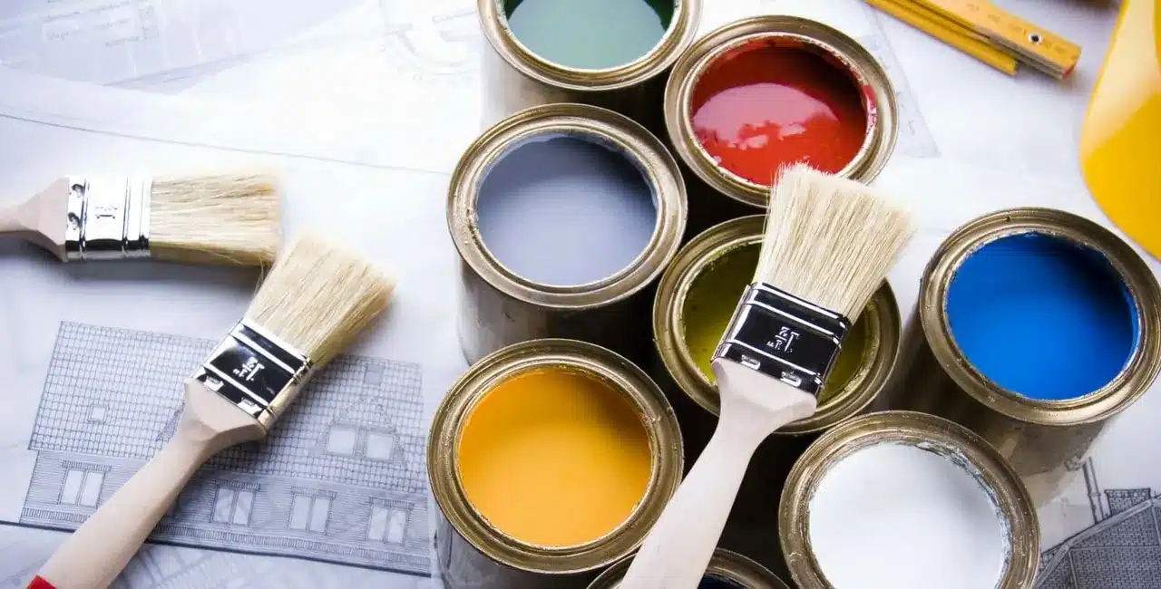
Colour Palette for Homes is one of the most cost effective ways to update your interior. Though, It is surprising that 70% of the Australians still choose to paint their walls white.
Despite being brave putting together colourful outfits, we’re still scared of putting colour in our homes for fear of getting it wrong. So to help people get over their fear of colour, here are ten (10) easy tips that will help you understand, choose and use the best colour for your home.
Tip 1: When Picking Your Colour Scheme, Get The Proportions Correct

There’s the 60-30-10 rule. You divide your room into 60% of the dominant colour, 30% of the secondary colour, and 10% of the accent colour. You capture the overall theme with the 60% hue, interest with 30% colour and the 10% shade. Much like jewelry provides a little sparkle and pop.
Tip 2: Embrace The Emotion Of Colour In Your Home

Before you choosing colour pallete for homes, understand the emotional connection that you and your family have for certain hues. Some people might consider green as fun and energetic while others would associate it with a negative connotations like greed or envy. Colour is personal, so understanding what moods and certain hues will help you narrow your colour choices.
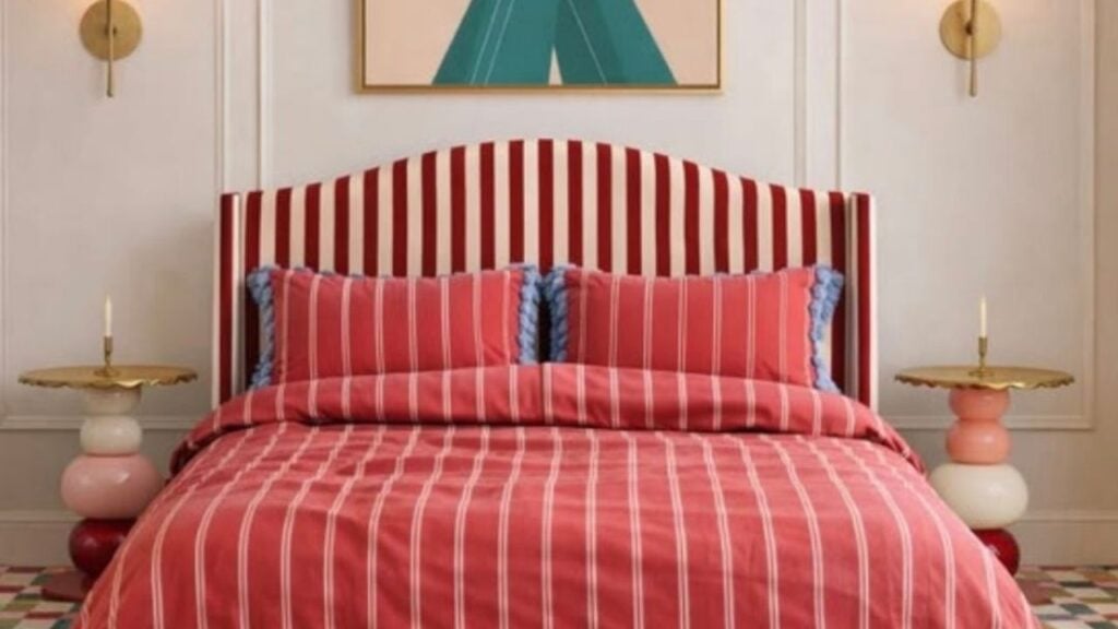
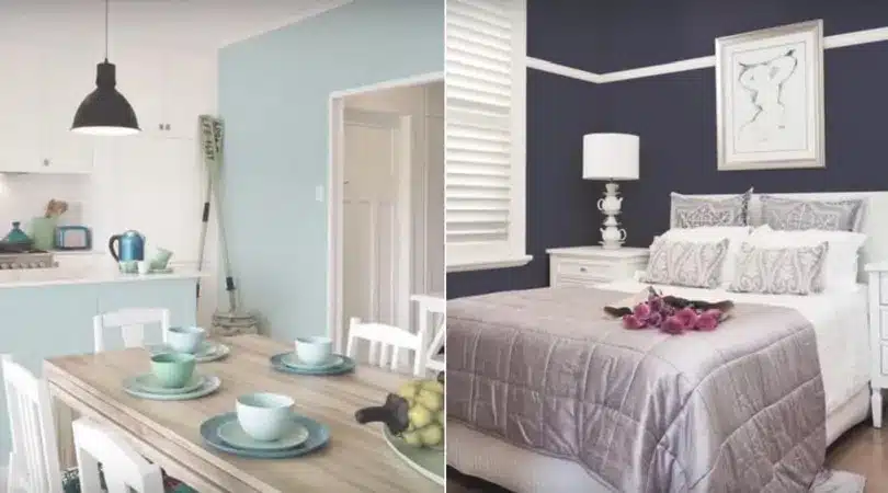
Tip 3: For A Visually Striking Room, Choose Complementary Colours

Complementary colours are colours that are directly opposite to each other on the colour wheel. So you’ve got red and green, or blue and orange. Creating a colour palette for homes using these complementary colours will create a visually exciting room as colours pop against each other. Try a complementary colour scheme first in a living or dining room so that you’ll get used to the vibrancy of it before choosing it in your bedroom.
Tip 4: For Casual Feel, Choose Analogous Colours

Analogous colours are situated next to each other on the colour wheel such as blue and violet or yellow and green. These are great options for those seeking a not-so daring look. A colour palette for homes of analogous colours creates a restful and muted feel that’s really well suited for bedrooms as it inspires rest and recovery.
Tip 5: Embrace Bright Colours When Interior Painting To Create The Illusion Of Space.

It’s a common misconception that using white is the only way to make a room bigger. Bright and vibrant colours can instantly add the feeling of space in your home if you use it correctly. So to get this look right, it’s important to mirror the colour of your walls in your flooring. This doesn’t mean painting your floors fuchsia to match the walls. But if you put an accent of fuchsia on your rug in a similar tone, it’ll do the same job. This makes the room feel like it’s one big open space.
Tip 6: Manipulate Space With The Right Colour Combinations

So when you’re painting a space, there are many tricks you can play to the eye by simply using the right colours. Cool shades recede whereas warm colours come towards you. To make the space look bigger, it’s really good to use cool colours. Or to make the room feel more cozy, use warm colours. important to mirror the colour of your walls in your flooring. This doesn’t mean painting your floors fuchsia to match the walls. But if you put an accent of fuchsia on your rug in a similar tone, it’ll do the same job. This makes the room feel like it’s one big open space.
Tip 7: Add Sophistication To A Playful Colour Palette Using Black

Most people think bright colours create a childish interior. But a few elements of black create a whole different feel. Something simple as a lampshade, coffee table, or a picture frame is the perfect way to do it. This will clarify and enhance all the colours in the room but add a sophisticated edge.
Tip 8: Warm Up Or Cool Down Your Home With Colour
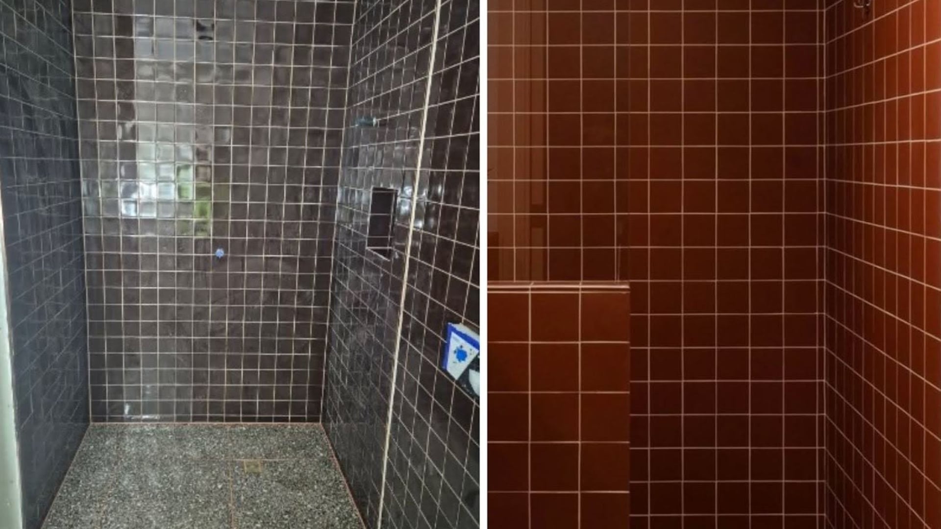
Deep and richer tonal tones like reds, oranges, and yellows traditionally create a feeling of warmth. For a twist, you can be bold and select an intense shade like indigo, which has a hint of red that actually makes it a warm blue. Use cooler colour schemes like greens, blues, and grey based pastels to create a fresher cleaner colour palette for homes. Blue and white is a popular choice for beach side homes as it creates a bright and breezy feel. But you can warm up this cool palette and soften the sharp contrast with natural timbers like oak and pine.
Tip 9: A Neutral Palette Can Still Be Impactful

It’s a misconception that neutral colour scheme is boring. The key to creating interest is to remember that neutrals don’t have to be just beige, tan, or white. Consider warm golds, rich caramel browns, or shades of grey paired with black and chocolate brown to put a fun twist to those everyday neutrals.
Tip 10: Use Colours From Your Past As Inspiration

Inspiration can be found from all around. The most impactful choices can be colours from your childhood that remind you of fun memories. Translating a colour from a happy memory to your interior will create a positive atmosphere in your home.
Hope these tips help give you the confidence to be brave with colour choices. There are plenty more tips at taubmans.com.au to help you gain inspiration for your next painting project.
WATCH VIDEO HERE
By: Shaynna Blaze
Taubmans Colours Creative Director
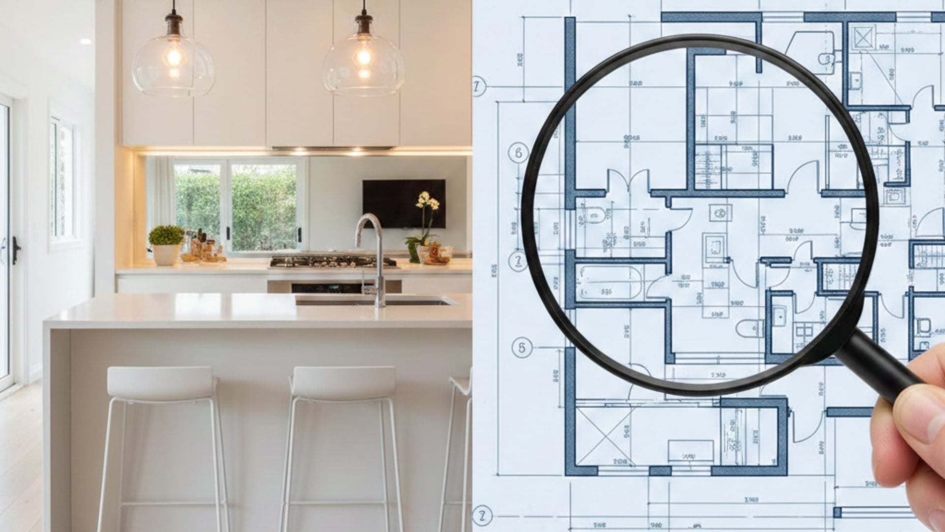
The $100k Renovation System
The Ultimate Program to Maximise Reno Profits while Keeping Risk to a Minimum and Without Picking up a Paintbrush.